
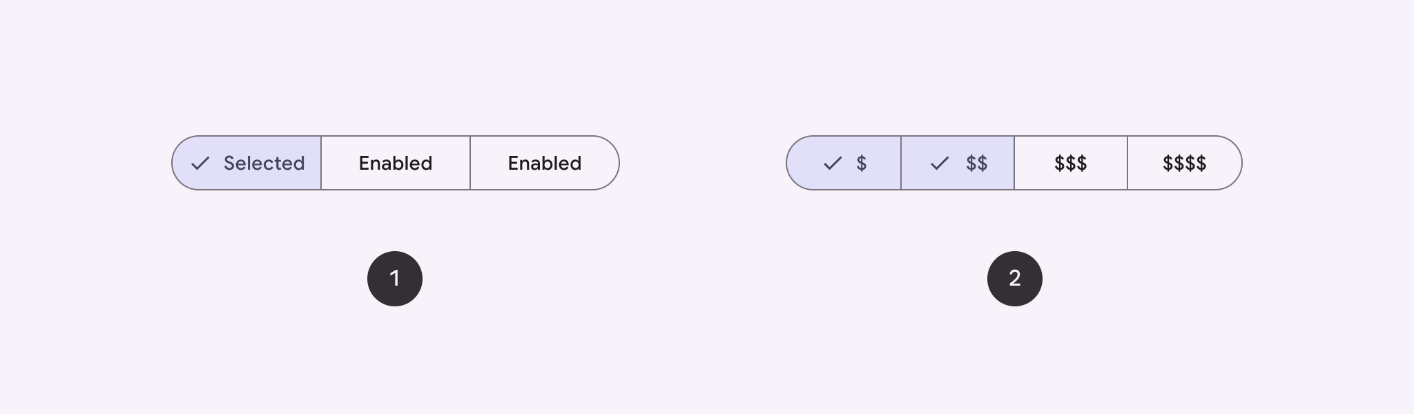
Use a segmented button to let users choose from a set of options, side-by-side. There are two types of segmented buttons:
- Single-select button: Lets users choose one option.
- Multi-select button: Lets users choose between two and five items. For more complex choices, or more than five items, use chips.
API surface
Use the SingleChoiceSegmentedButtonRow and
MultiChoiceSegmentedButtonRow layouts to create segmented buttons. These
layouts position and size SegmentedButtons correctly,
and share the following key parameters:
space: Adjusts the overlap between the buttons.content: Contains the content of the segmented button row, which is typically a sequence ofSegmentedButtons.
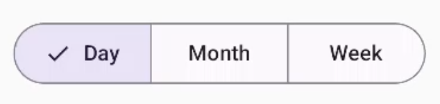
Create a single-select segmented button
This example shows how to create a single-select segmented button:
@Composable fun SingleChoiceSegmentedButton(modifier: Modifier = Modifier) { var selectedIndex by remember { mutableIntStateOf(0) } val options = listOf("Day", "Month", "Week") SingleChoiceSegmentedButtonRow { options.forEachIndexed { index, label -> SegmentedButton( shape = SegmentedButtonDefaults.itemShape( index = index, count = options.size ), onClick = { selectedIndex = index }, selected = index == selectedIndex, label = { Text(label) } ) } } }
Key points about the code
- Initializes a
selectedIndexvariable usingrememberandmutableIntStateOfto track the selected button index. - Defines a list of
optionsrepresenting the button labels. SingleChoiceSegmentedButtonRowlets you select only one button.- Creates a
SegmentedButtonfor each option, inside theforEachIndexedloop:shapedefines the button's shape based on its index and the total count of options usingSegmentedButtonDefaults.itemShape.onClickupdatesselectedIndexwith the clicked button's index.selectedsets the button's selection state based onselectedIndex.labeldisplays the button label using theTextcomposable.
Result
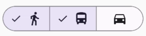
Create a multi-select segmented button
This example shows how to create a multi-choice segmented button with icons that lets users select multiple options:
@Composable fun MultiChoiceSegmentedButton(modifier: Modifier = Modifier) { val selectedOptions = remember { mutableStateListOf(false, false, false) } val options = listOf("Walk", "Ride", "Drive") MultiChoiceSegmentedButtonRow { options.forEachIndexed { index, label -> SegmentedButton( shape = SegmentedButtonDefaults.itemShape( index = index, count = options.size ), checked = selectedOptions[index], onCheckedChange = { selectedOptions[index] = !selectedOptions[index] }, icon = { SegmentedButtonDefaults.Icon(selectedOptions[index]) }, label = { when (label) { "Walk" -> Icon( imageVector = Icons.AutoMirrored.Filled.DirectionsWalk, contentDescription = "Directions Walk" ) "Ride" -> Icon( imageVector = Icons.Default.DirectionsBus, contentDescription = "Directions Bus" ) "Drive" -> Icon( imageVector = Icons.Default.DirectionsCar, contentDescription = "Directions Car" ) } } ) } } }
Key points about the code
- The code initializes the
selectedOptionsvariable usingrememberandmutableStateListOf. This tracks the selected state of each button. - The code uses
MultiChoiceSegmentedButtonRowto contain the buttons. - Inside the
forEachIndexedloop, the code creates aSegmentedButtonfor each option:shapedefines the button's shape based on its index and the total count of options.checkedsets the button's checked state based on the corresponding value inselectedOptions.onCheckedChangetoggles the selected state of the corresponding item inselectedOptionswhen the button is clicked.icondisplays an icon based onSegmentedButtonDefaults.Iconand the button's checked state.labeldisplays an icon corresponding to the label, usingIconcomposables with appropriate image vectors and content descriptions.
Result
Additional resources
- Material 3: Segmented buttons